PROJECTS
WORKFLOW
Project Overview
Research & Competitive Analysis
Problem Statement
Solution
Design Approach & Execution
Outcomes & Key Takeaways
TEAM
Olga Markaki
Eua Mara
Moses Kiventidis
TIME
2024
1 week
WORKFLOW
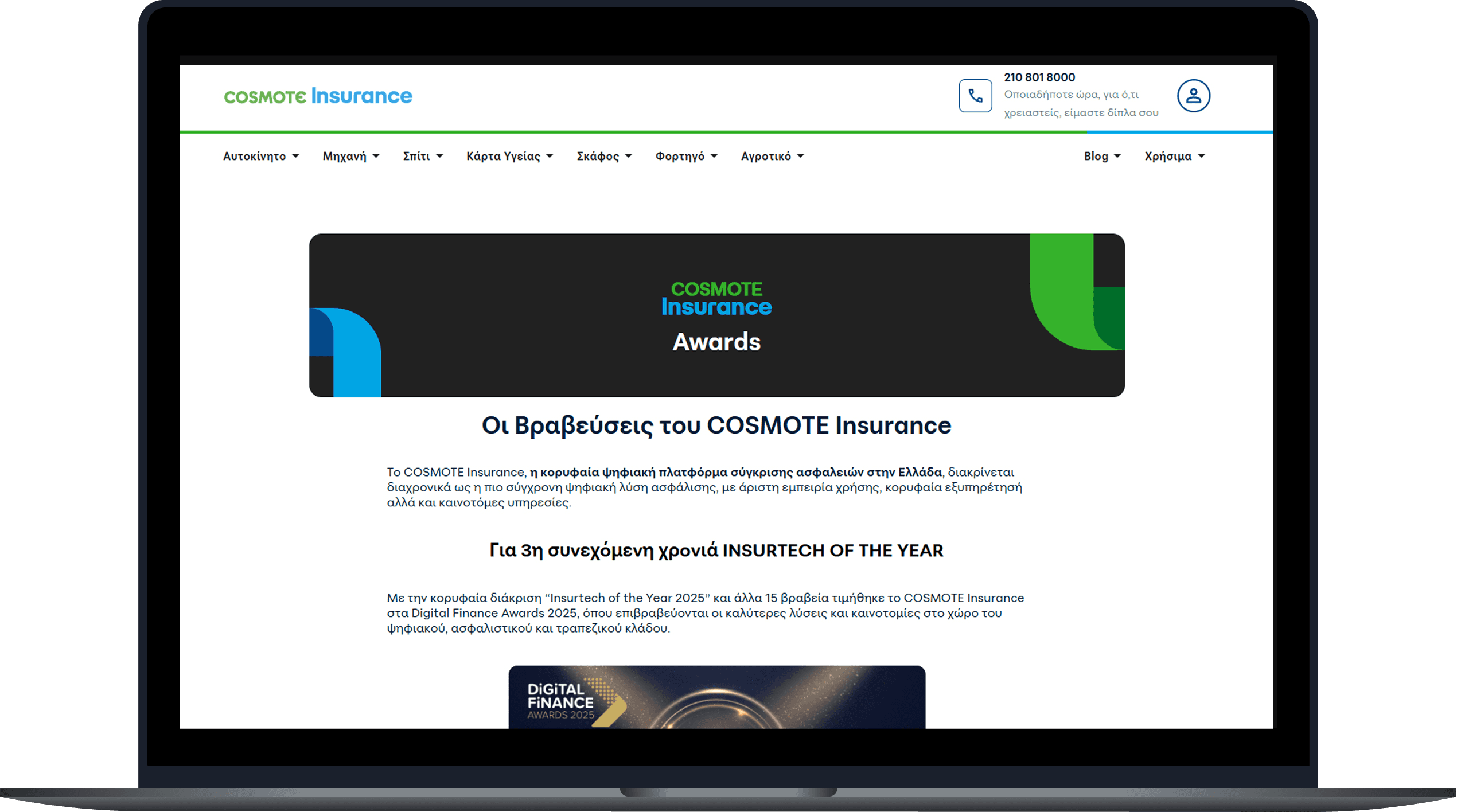
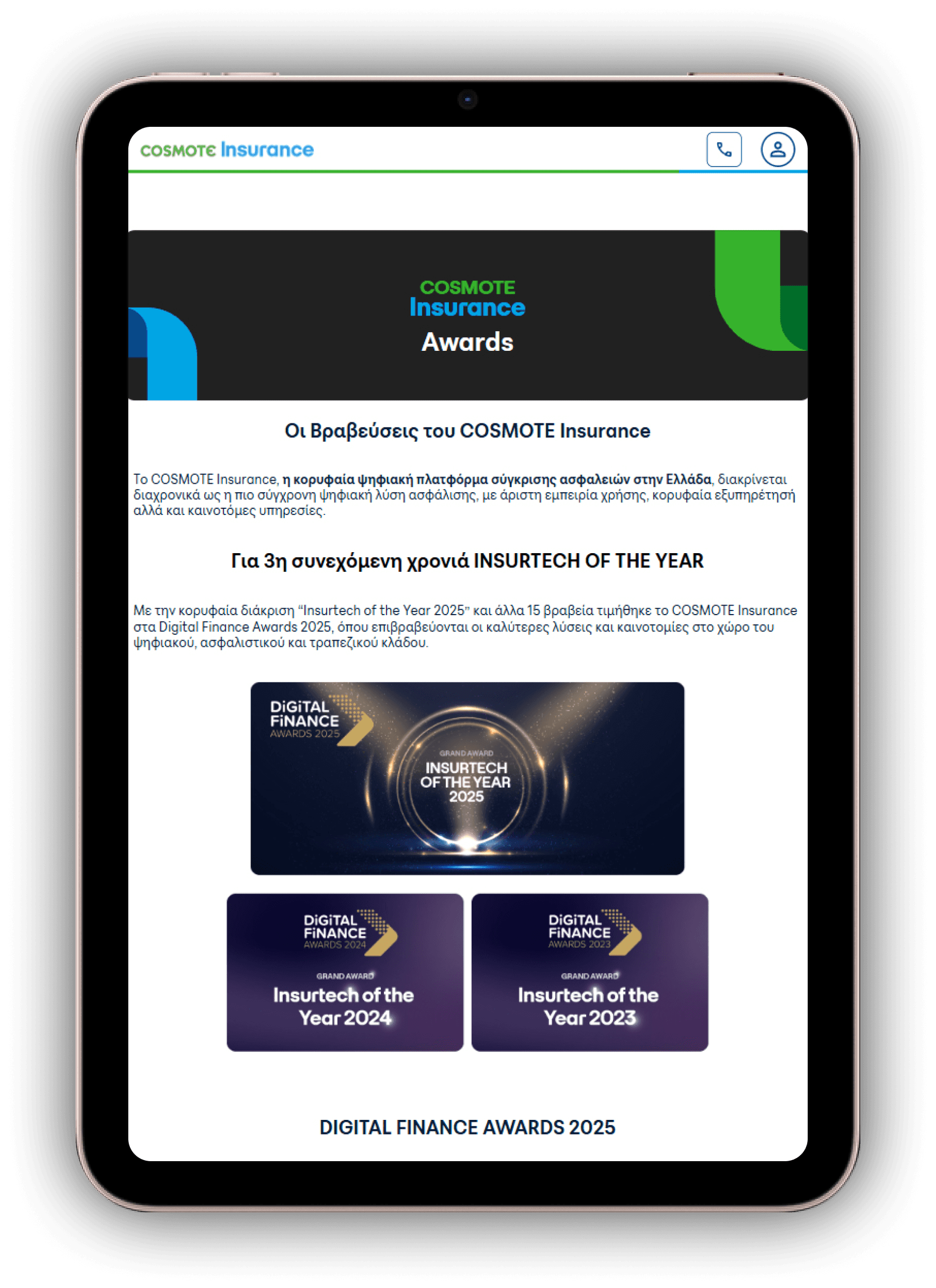
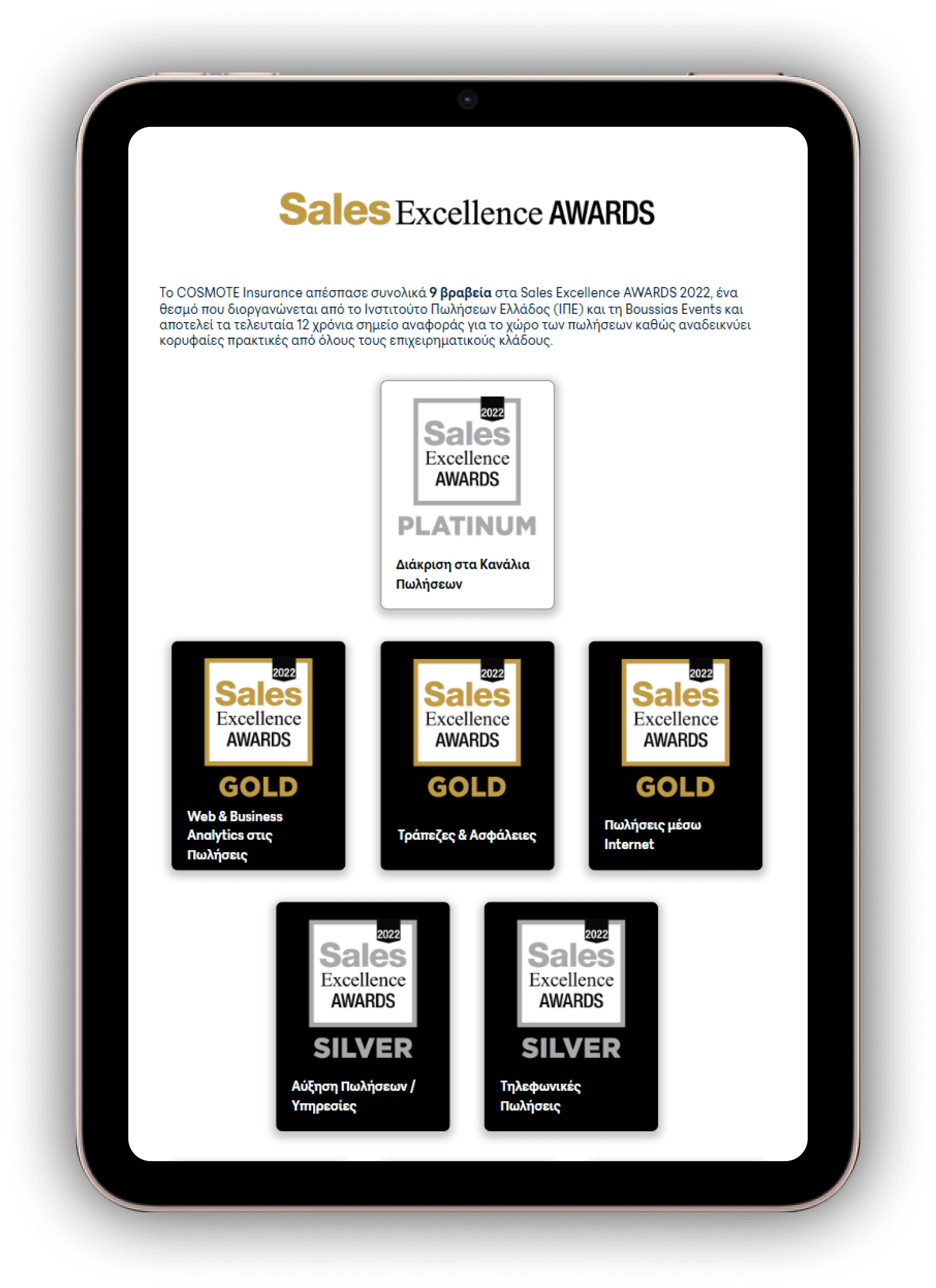
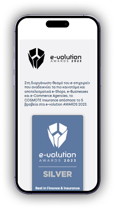
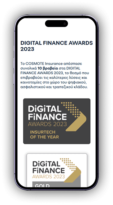
Cosmote Insurance - Award Page
Links
Project Overview
Cosmote Insurance aimed to create an annual report that was easy to understand and accessible to all users. I designed a responsive landing page to summarize the most crucial insights and a detailed PDF for those who wanted more in-depth information.
Research & Competitive Analysis
We analyzed awards pages from leading insurance companies to identify industry standards and best practices. Many competitors effectively utilized structured layouts, visual hierarchy, and responsive designs to ensure accessibility across all devices. The existing Cosmote Insurance Awards page lacked these elements, making navigation difficult and failing to properly showcase the company’s accomplishments.
Problem Statement
The previous awards page was not responsive, resulting in a poor experience on mobile devices.
The layout and visual structure did not effectively highlight the company's achievements.
Lack of hierarchy made it difficult for users to quickly grasp key information.
Solution
Responsive redesign to ensure seamless functionality across all screen sizes.
Improved layout with a structured visual hierarchy for better readability.
Modernized aesthetics aligned with Cosmote Insurance’s brand identity.
Optimized navigation to enhance usability and user engagement.
Design Approach & Execution
The primary objective of this project was to design a responsive, visually compelling landing page that effectively highlights Cosmote Insurance's awards. The previous version of the awards page was poorly structured and lacked responsiveness, which significantly impacted user engagement. My approach was centered on refining the visual presentation, improving accessibility, and ensuring a seamless experience across all devices.
Content Structuring
I began by organizing the content clearly, with distinct sections for each award category and relevant details. I prioritized simplicity to avoid overwhelming users with information.
Visual Design
I implemented a clean and modern design using the company’s branding, incorporating icons and imagery to highlight each award. Visual hierarchy played a key role in guiding the user through the content, ensuring the most important information was prominent.
Responsive Layout
The landing page was designed to adjust seamlessly to all screen sizes, from desktops to mobile devices, ensuring an optimal viewing experience for every user.
User-Centered Focus
I kept the user experience at the forefront of the design process. I simplified navigation and reduced cognitive load by presenting the information in bite-sized, easy-to-read sections. This made the content more engaging and accessible.
Feedback & Iteration
After developing the first version of the page, I sought feedback from the team to ensure that all key elements were represented and that the page met both business goals and user expectations. Iterative adjustments were made based on feedback to fine-tune the final design.
Outcomes & Key Takeaways
The redesigned awards landing page significantly enhanced both user experience and accessibility by emphasizing visual clarity, organized content, and brand consistency:
✔ Responsive design ensuring accessibility and seamless usability across all devices.
✔ Effective visual storytelling that highlights key achievements while reinforcing brand perception.
✔ Simplicity in design, allowing essential content to be presented clearly without overwhelming the user.
This project underscored three key principles:
Responsive design is crucial for accessibility
→ Adapting content across various devices ensures optimal usability and drives higher engagement.
Consistency with brand identity is vital.
→ Aligning with the brand’s established visual language and design system strengthened recognition and trust.
Achieving the right balance between simplicity and depth optimizes user retention.
→ Presenting concise yet insightful content keeps users engaged while avoiding cognitive overload.