PROJECTS

Enhancing User Experience with a Modern Website Redesign for Tripod

WORKFLOW

Project Overview

Research & Competitive Analysis

Problem Statement

Solution

Design Approach & Execution

Outcomes & Key Takeaways

TEAM

Olga Markaki

TIME

In Progress

WORKFLOW

Redesign - Tripod Structural Engineering

Project Overview

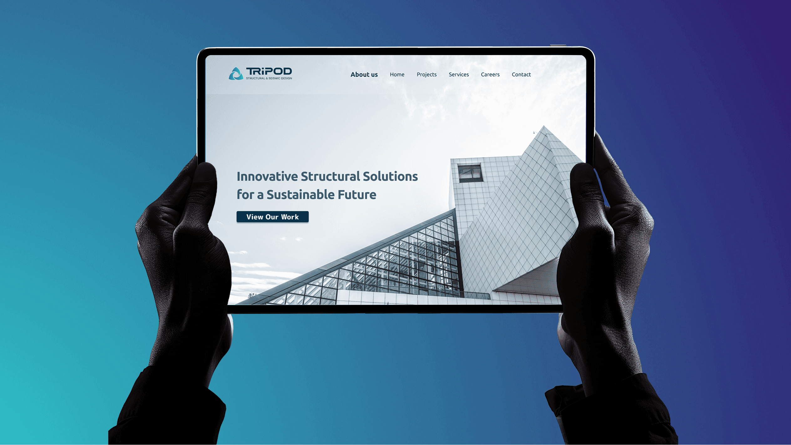
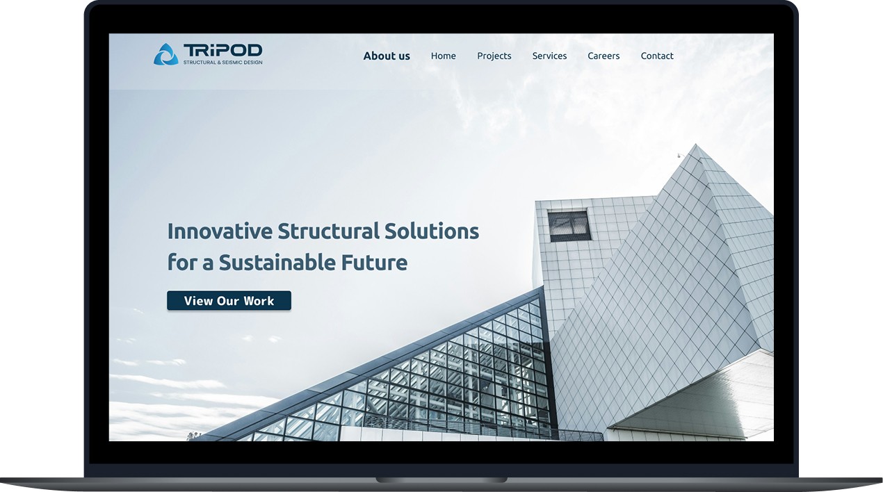
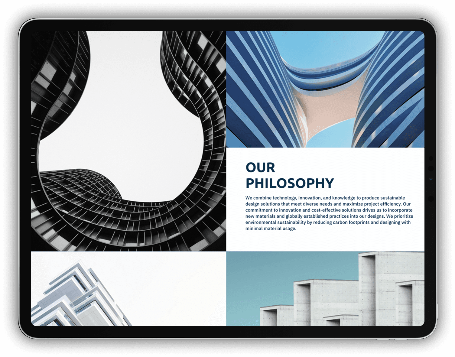
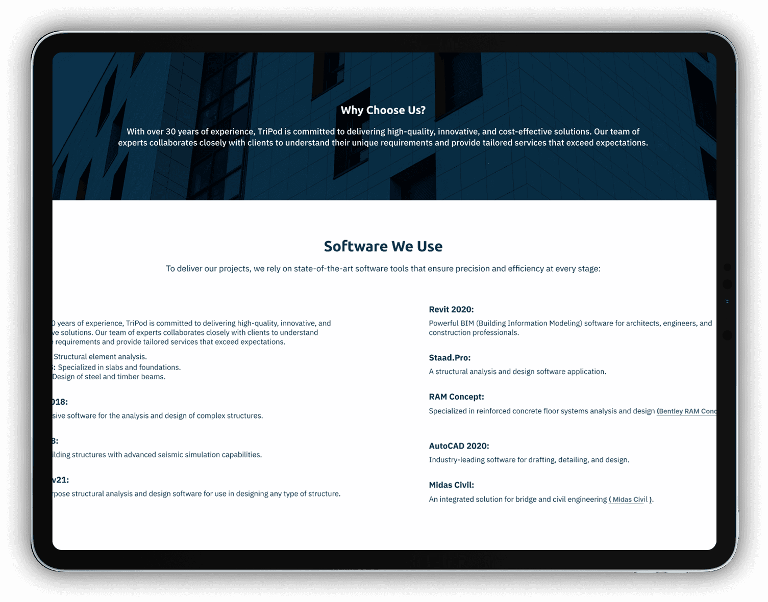
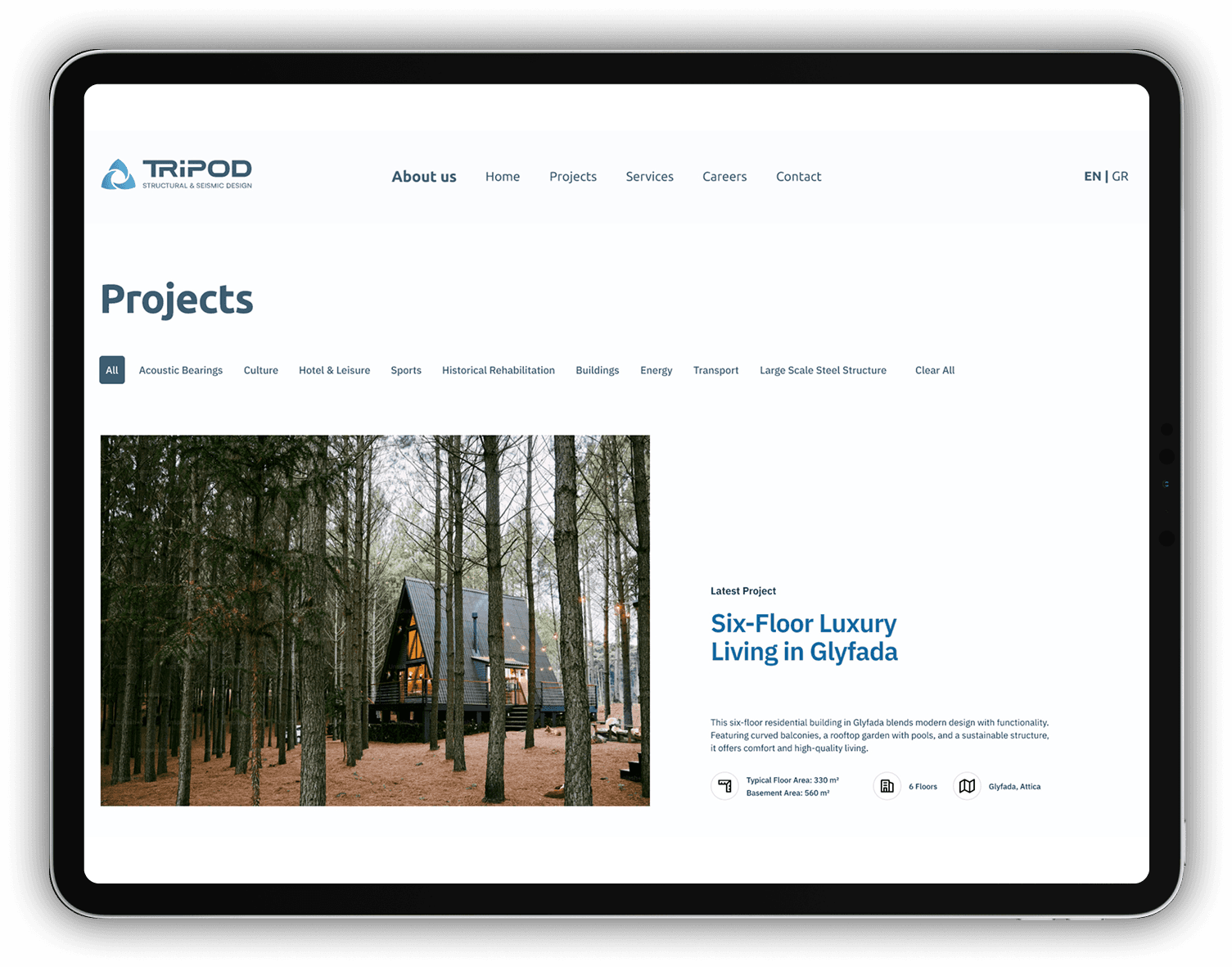
Tripod, a company specializing in structural and seismic studies, sought to redesign its website to reflect modern usability and aesthetic standards. The goal was to create a minimalist and visually appealing platform that showcases the company's projects using large, high-resolution images.​

Research & Competitive Analysis

An extensive competitive analysis was conducted, focusing primarily on international websites of structural engineering firms. This research highlighted industry best practices, such as the use of clean lines, emphasis on visual elements, and seamless user experience. These findings guided the design to ensure that Tripod's new website would be competitive on a global level.

Problem Statement

Tripod's previous website exhibited the following issues:

  1. Outdated design: Its aesthetics did not align with modern standards.

  1. Limited usability: Navigation was cumbersome, and the site was not responsive to mobile devices.

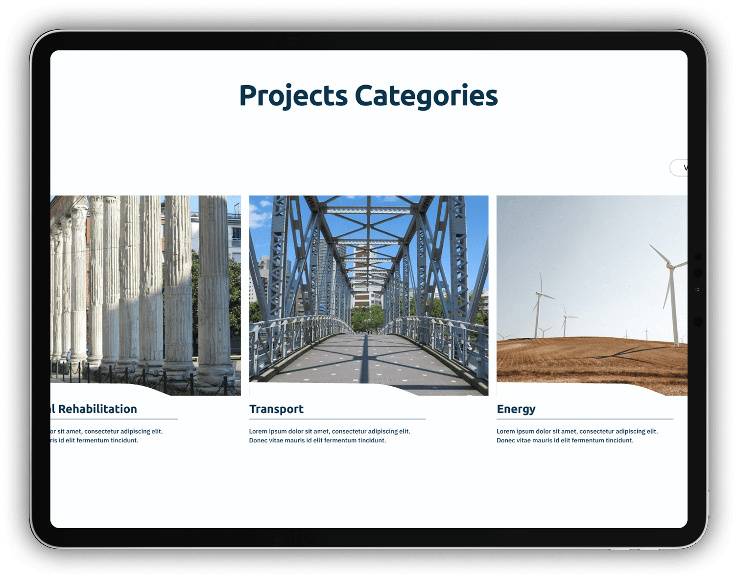
  1. Lack of visual project representation: Project images were small and did not effectively showcase the quality and scope of the company's services.

  1. Monolingual content: Absence of a Greek version, despite the company's presence in Greece.

Solution

To address these issues, the following design was proposed and implemented:

  1. Modern and minimalist design: Utilization of clean lines, ample white space, and a limited color palette for an elegant appearance.

  1. Large, high-resolution images: Showcasing the company's projects in a way that highlights their quality and scope.

  1. Improved navigation: Redesign of the menu structure for easy access to sections like "Projects," "About Us," "Services," "Careers," and "Contact."

  1. Bilingual capability: Integration of a language selection feature to switch between English and Greek, with a default setting based on the user's location.

  1. Responsive design: Ensuring an optimal user experience across all devices, from desktops to smartphones.

Design Approach & Execution

Based on our research findings, we focused on creating a clean, modern, and visually appealing annual report that enhances user engagement. The design process involved several key steps:

  1. High-Fidelity Wireframes

Based on the research findings, high-fidelity wireframes were created, incorporating the desired functionalities and aesthetics of the new website. These wireframes provided a detailed depiction of the final layout and functionality, allowing for a direct transition to design development.

Outcomes & Key Takeaways

The redesign of Tripod's website has already led to significant improvements in user experience and corporate image:

  • Enhanced corporate image.

→ The modern and minimalist design showcases the company's expertise and professionalism.

  • Improved project presentation.

→ The use of large, high-resolution images effectively highlights Tripod's completed projects.

  • Upgraded navigation

→ The reorganization of the menu and clear content structure facilitate user navigation.

Although the current version of the website is optimized for desktop computers, the need for full adaptation to mobile devices is recognized. The development team is working towards this goal, aiming to provide a consistent and user-friendly experience across all platforms.

Work

UI/UX Design case studies

A glimpse into my UI/UX design process, where creativity meets functionality to enhance user experiences

UX/UI DESIGN

Transforming Insurance Reports: A New Visual Approach for Cosmote Insurance

UI DESIGN

Showcasing Excellence: An Enhanced Digital Experience

UX/UI DESIGN

Enhancing User Experience with a Modern Website Redesign for Tripod

UX/UI DESIGN

Building a Seamless Property Search Journey with Kentriki

UX/UI DESIGN

Symmetria: A Digital Transformation for Luxury Aesthetics