PROJECTS
WORKFLOW
Project Overview
Research & Competitive Analysis
Problem Statement
Solution
Design Approach & Execution
Outcomes & Key Takeaways
TEAM
Olga Markaki
Eua Mara
Dimitra Berniadaki
Moses Kiventidis
Giota Exarchopoulou
Michael Tsakirgiannis
TIME
2024
1 month
WORKFLOW
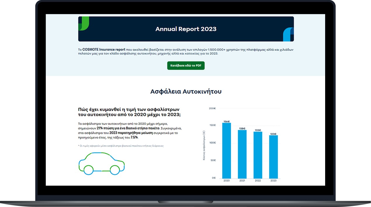
Cosmote Insurance - Annual Report 2023
Project Overview
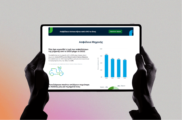
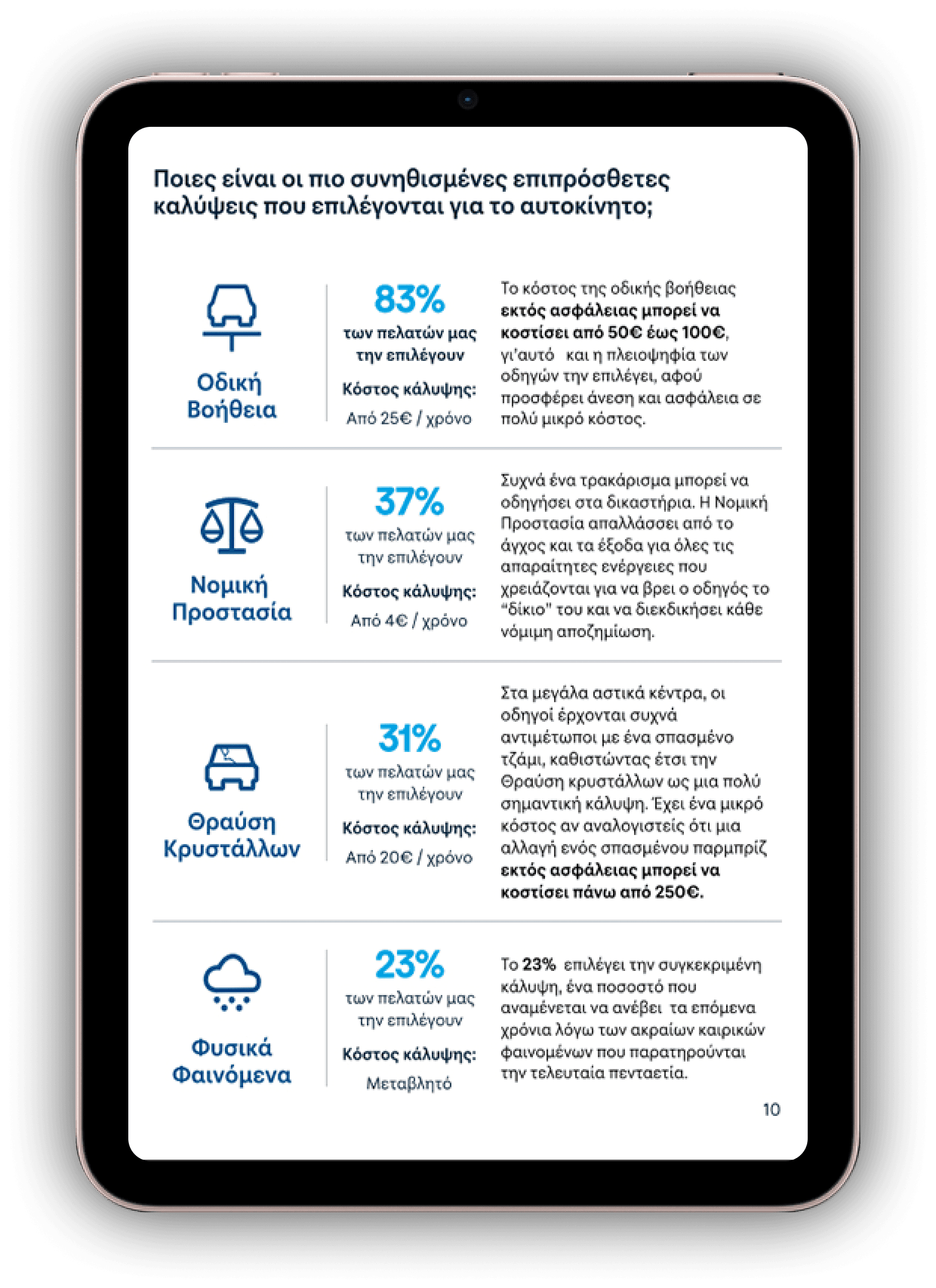
Cosmote Insurance aimed to create an annual report that was easy to understand and accessible to all users. I designed a responsive landing page to summarize the most crucial insights and a detailed PDF for those who wanted more in-depth information.
Research & Competitive Analysis
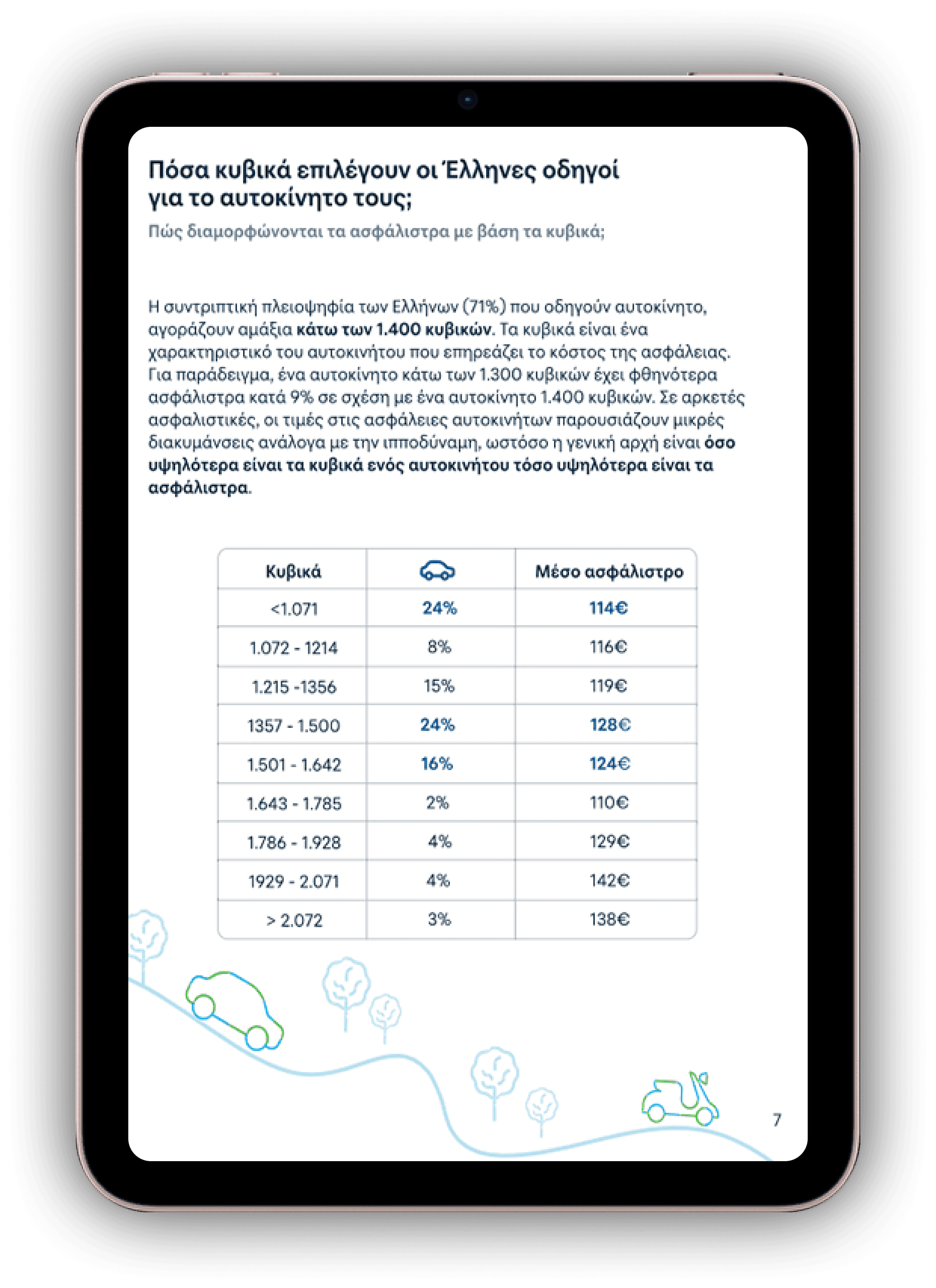
Working closely with my team, I conducted in-depth research to determine the key information to be presented and the most effective way to communicate it. We analyzed industry trends and structured our content based on strategic questions to ensure clarity and engagement. Additionally, we performed a competitive analysis of both international and Greek insurance companies. While leading global companies like Europa, Lemonade, and Zebra incorporated more visual elements, Greek companies primarily relied on lengthy, text-heavy reports (100-200 pages), making them less engaging. These insights guided our approach, allowing us to prioritize data visualization and develop a more concise, user-friendly annual report that stood out in the industry.
Problem Statement
Lengthy, text-heavy reports discourage user engagement.
Lack of responsive design limits readability across devices.
Solution
Concise landing page summarizing key insights.
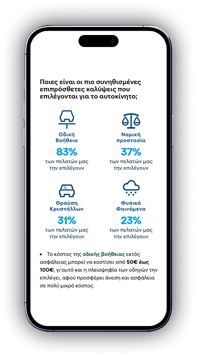
Infographics & icons to enhance data comprehension.
Well-structured PDF balancing detail with readability.
Responsive design ensuring seamless access on all devices.
Design Approach & Execution
Based on our research findings, we focused on creating a clean, modern, and visually appealing annual report that enhances user engagement. The design process involved several key steps:
Content Structuring
I prioritized clarity by structuring the report into well-organized sections, each addressing specific areas such as financial performance, strategic goals, and achievements.
Visual Storytelling
I used clear typography, corporate colors, and infographics to make data easier to understand.
Responsive Design
I ensured the report would be easily accessible across all devices, with special attention paid to the mobile experience.
Feedback & Iteration
After presenting an initial version, I worked with the team to refine the layout, ensuring the final design met both business goals and user expectations.

Outcomes & Key Takeaways
The redesigned annual report significantly improved user experience and engagement by adopting a more accessible, structured, and visually compelling approach:
✔ Enhanced user experience through engaging visuals and well-structured content.
✔ Clean insights by transforming complex data into easily digestible segments.
✔ Improved accesibility with a responsive design, ensuring seamless readability across devices.
✔ Increased engagement by minimizing information overload while preserving key details.
This project underscored the importance of:
Visual storytelling enhances comprehension.
→ Using images, infographics, and structured layouts makes complex data easier to understand.
Striking the right balance between brevity and depth optimizes retention.
→ Providing concise yet informative content keeps users engaged without overwhelming them.
Responsive design is essential for accessibility.
→ Ensuring content adapts seamlessly to different screen sizes improves usability.